|
User
Reviews 29
Approval 97%
Soundoffs 31
News Articles 6
Band Edits + Tags 54
Album Edits 109
Album Ratings 906
Objectivity 92%
Last Active 04-07-18 8:10 am
Joined 01-06-15
Review Comments 315
| Ranking Soundgarden's Album Artwork
Today, we're counting the six studio albums, plus an honourable mention.
I liked making the Deftones artwork list, and it got a good reception, so naturally I'm deciding to run this idea into the ground.
I'm thinking about maybe doing this as a weekly or bi-weekly thing, if it wouldn't clog up the list space too much. Only reason I'm doing this one quicker is because I got impatient. | | 7 |  | Soundgarden
Telephantasm
This is the honourable mention. When I make the lists, I try to keep it to the bare essentials like studio albums, because I like to keep it more efficient and I don't want my lists to be cluttered with tiny releases. This is fucking beautiful though - maybe even in the Top 3 if I counted it - and I'd be a dickhead not to at least acknowledge it. Anyway, on with the show. | | 6 |  | Soundgarden
Badmotorfinger
Here's my issue. On one hand, in design it's technically superior to Ultramega OK's half and half. There's a clear focal point, and it's almost psychedelic in its curling, blurring design (except the sparkplug, I don't think those are psychedelic.) On the other hand, I can't bring myself to say "Hot damn, this sure is an attractive piece of artwork and this absolutely relates to Soundgarden and I should be respectful and at least put it at #5." It looks like a circle of fish hooks. | | 5 | 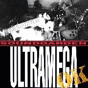 | Soundgarden
Ultramega OK
Half the cover is a black block of Ultramega OK, and I don't think I'm okay with that. The other half is a fantastic photo of the band covered in lens flare, and now I'm double the amount of not okay with that black slab taking up half the front cover. Really, if that cover was any more compressed Badmotorfinger would get a reprieve, but those artworks are in the same tier, I just like the human element more in this one. | | 4 | 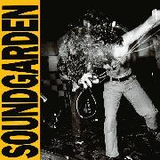 | Soundgarden
Louder Than Love
Even with the sheen and experimentation of the later albums, this picture of Cornell putting all his weight into the music sums up the explosive nature of Soundgarden. Last week we had a few users debating the Around the Fur cover, and how they interpreted it as the blend between violence and sexuality, and as a representation of the album's/band's sound. I'm getting what they're getting at with this cover.
Still don't like ATF's cover too much though. | | 3 |  | Soundgarden
King Animal
I believe this is by the same man who did the Telephantasm artwork, and I'd have to say this would go under Telephantasm. Not that it's not gorgeous, that stack of skulls and bones is delightfully gothic and I love its contrast against the pure white hues. For me, personally, after looking at every other distorted picture of the band or associating them with darkness and black, looking at a carefully staged, pure white cover is a jarring tonal shift, and it looks just too... clean. Still, it's glorious. I'm sure if Wes Anderson wanted to make a film of pure evil he could probably get this guy. | | 2 |  | Soundgarden
Superunknown
Another distorted picture of the band, to the point of elvish features (sadly, Superunknown did not get a cameo in The Hobbit.) I don't believe the band would ever play a burning forest, but the combination of the two images is an idea of the band's sound: a distorted, upside down reality where everything that could've gone wrong, did go wrong. Surprisingly, I find it more minimalist as a cover compared to everything else: there's a clear amount of detail, sure, but the dichotomy is easily there, the palette is small, even if we don't know it's a burning forest upside-down we see the fiery passion in the band anyway. It's well constructed. | | 1 | 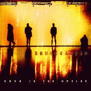 | Soundgarden
Down on the Upside
This pretty much had to be #1 for me. The grime of the colour scheme somehow seems to breathe light at the same time, our ever-gloomy heroes are for once clearly defined in silhouette against the backdrop, the dark yellow can be perfect symbolism for digging out of depression but not quite making it... It's the perfect (and unintentional) transition between the light of King Animal and the darkness of Superunknown, while managing to imbue it's own sense of personality. Really it's that colour though. Holy shit. I love it. | |
danielcardoso
09.14.16 | Nice list, interesting descriptions too mate. for me it'd prob go 2 > 1 > 3=6 , the others have pretty average covers. | ArsMoriendi
09.14.16 | 1 has the best album cover and is their best alb yay | DominionMM1
09.14.16 | the guy you're referring to for 3 is josh graham | onionbubs
09.14.16 | 1 2 7 3 6 4 5
love these lists youve been making. cool seeing artwork related lists that arent just "here are my favorite album covers" | DoofusWainwright
09.14.16 | 3 seems the least in keeping with the others - 'reboot' artwork | FullOfSounds
09.14.16 | Glad 7 got a shout, I've always loved it | porcupinetheater
09.14.16 | I've always really dug Badmotorfinger's art, find it a lot more interesting than the "here's action shots of the band" stuff on 4+5 | laughingman22
09.14.16 | I usually hate it when a cover is a picture of the band/artist, but 4 is their best cover. Just some pure sexy rock n roll | FullOfSounds
09.14.16 | "I usually hate it when a cover is a picture of the band/artist, but 4 is their best cover. Just some pure sexy rock n roll"
Puddle of Mudd's album Famous is the worst example of this.
We have Wes sitting on a stack of tires. | laughingman22
09.14.16 | Holy shit that cover is bad |
|