|
User
Reviews 5
Approval 44%
Soundoffs 34
News Articles 2
Band Edits + Tags 0
Album Edits 7
Album Ratings 1555
Objectivity 69%
Last Active 07-22-22 4:28 pm
Joined 09-11-03
Review Comments 18,070
| The Scientifically Verified Pink Floyd Album Art Rankingz
In response to the recent release of flawed data, the scientists make a return to set the record straight.rPS: RIP Storm Thorgerson | | 1 |  | Pink Floyd
The Dark Side of the Moon
Classic. Beautiful. Simple. Iconic. | | 2 |  | Pink Floyd
Animals
Just a gorgeous photograph. The pig overseeing the Battersea Power Station represents the concept of the album perfectly. Battersea is a rather wonderful piece of architecture considering it's a power-plant. | | 3 |  | Pink Floyd
Atom Heart Mother
Simplistic art. Gorgeous colors. Random. Fantastic | | 4 |  | Pink Floyd
The Piper at the Gates of Dawn
Photograph of the group in the late 60's with Syd. Another simple cover. The photograph is meant to simulate how one might be perceiving their environment while under the influence of certain mind-expanding chemicals. | | 5 |  | Pink Floyd
Meddle
A photograph of an ear underwater, apparently. Wonderful colors. Another simple and powerful cover. | | 6 |  | Pink Floyd
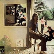
Ummagumma
Another psychedelic photograph similar to PATGOD. A photographs of the group hanging out, with duplicate photographs within the main photograph, but with the guys switching spots. | | 7 |  | Pink Floyd
A Momentary Lapse of Reason
http://famousafteridie.files.wordpress.com/2011/04/amomentarylapseofreason.jpg
Crazyness. Reminds me of Inception for some reason. Think of the effort it took to set up this shot. | | 8 |  | Pink Floyd
Wish You Were Here
This one is sure to take the most flack. The album is a masterpiece. The cover represents it well. But it is just too simple and literate for me.
Yes, I mentioned how I liked simplicity above, but abstract simplicity > literal simplicity. | | 9 |  | Pink Floyd
A Saucerful of Secrets
Very interesting cover with many layers. You need to see an enlarged picture or a vinyl cover to appreciate it. | | 10 |  | Pink Floyd
The Division Bell
A pretty neat and iconic piece of art. Nothing groundbreaking, though. | | 11 |  | Pink Floyd
The Wall
Uninspired, yet iconic. | | 12 |  | Pink Floyd
Obscured by Clouds
Boring. | | 13 |  | Pink Floyd
More
Neat, nice colors, lacks detail/depth and inspiration. | | 14 |  | Pink Floyd
The Final Cut
My least favorite. Again, too literate and simple, especially compared to the others. | |
charbyno
09.06.13 | haha lol....this IS a joke right?? | Greem
09.06.13 | mmmm | guitarded_chuck
09.06.13 | Hi! | SharkEthic
09.06.13 | man, fuck science, jesus would look at this list and be all like "whatever the fuck ever, dude" | JamieTwort
09.06.13 | Damn, this might be worse than the last one.
8 and 12 are WAY too low. | SharkEthic
09.06.13 | 5 should be 14, and 8 and 12 are way fucking low, agreed | RogueNine
09.06.13 | The techniques used to make the cover for 8 were genius, especially for 1975. 1 is 1 but 8 needs to be higher. | slep
09.06.13 | 2, 8, 9, 1, whatever | Smial
09.06.13 | bah w/e | Parallels
09.06.13 | 8 should be way higher | qwe3
09.06.13 | its roger waters' ear | AnotherBrick
09.06.13 | It's Rogers? I always thought it was a pig? | mryrtmrnfoxxxy
09.06.13 | 6 is top 3 prob | CK
09.06.13 | Yeah this is worse than mine good job | evilford
09.06.13 | placement of 3 and 8 is disturbing! | guitarded_chuck
09.06.13 | "Yeah this is worse than mine good job"
would be weird if you thought otherwise wouldn't it | evilford
09.06.13 | lol | CK
09.06.13 | True, but can you really justify having a cow's ass at 3? | evilford
09.06.13 | lol [2] | CK
09.06.13 | lol [lol] | laughingman22
09.06.13 | 7 may be the one of floyd's worst albums but it has the coolest cover |
|
